How do babies see the world? The development of colour perception from birth to one year
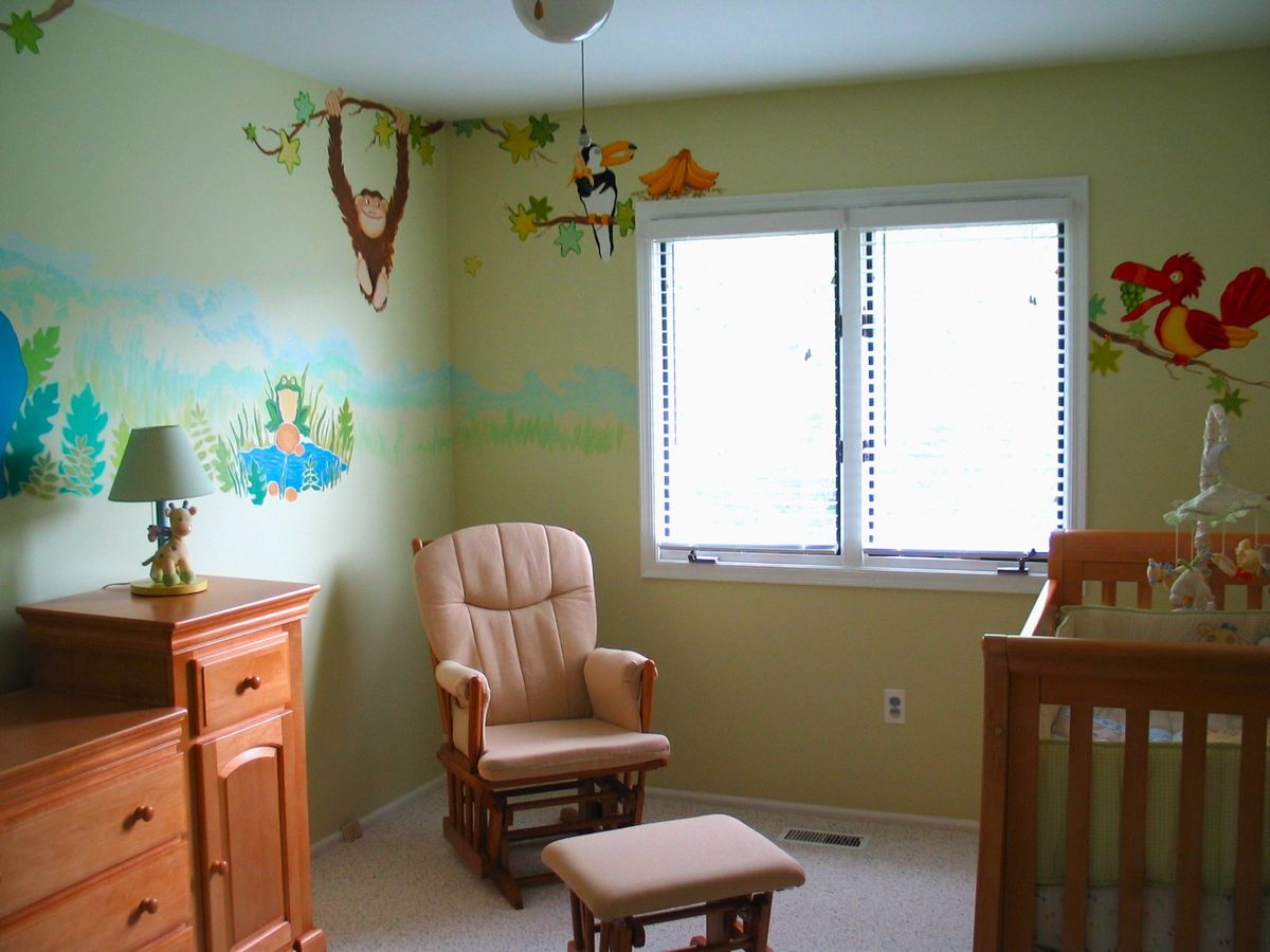
How do babies see the world? The development of colour perception from birth to one year
When you hold your newborn and look into their eyes, it's easy to assume they see you just as clearly. The truth is different. A newborn's world is made of blurred shapes, contrasts of light and shadow, and very few colours. Over the first six months that picture changes completely: from a little being responding mostly to shades of grey, your baby becomes an observer who recognises and sorts the colours around them.
I paint murals for children's rooms, and for years I've been watching how a thoughtfully designed visual environment works on the youngest viewers. In this article I've gathered what current science says about the development of colour vision in infants, and I show how to translate that knowledge into practical decisions about a child's room.
The first days of life: a world in shades of grey
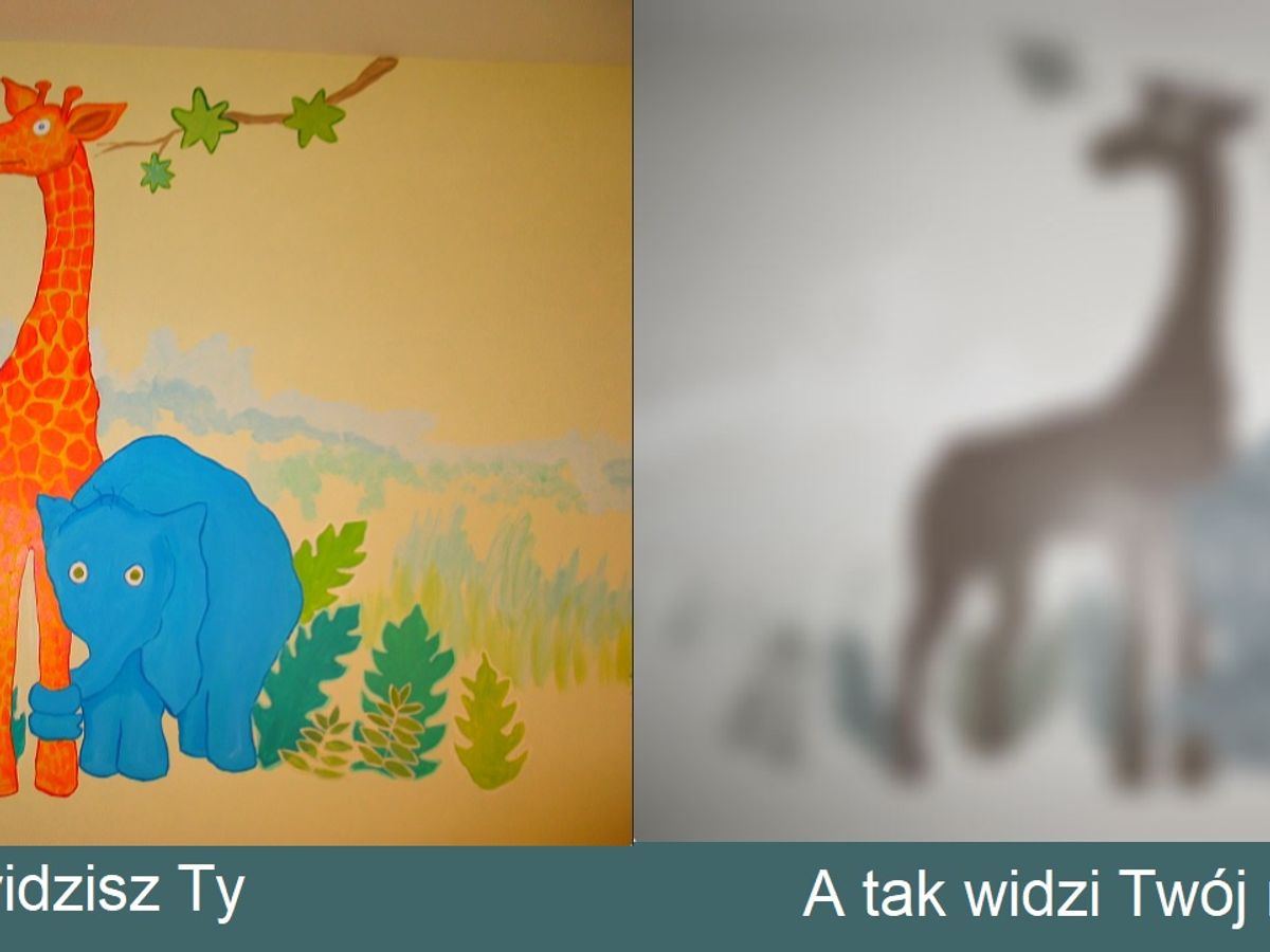
Contrary to popular belief, a newborn's vision isn't strictly black and white; it's more muted and low in contrast. Four-day-old babies can tell white from orange, but not white from yellow-green. The retina is still developing, and the cones, the photoreceptors responsible for recognising colour, are still immature.
A newborn's visual acuity is around 20/640. In practice this means that an object an adult can see from 640 feet (about 195 metres) only becomes visible to an infant from 20 feet (about 6 metres). For comparison: a person is considered legally blind at an acuity of 20/200 or worse.
At this stage, what we can best offer a baby visually is high contrast: black, white, vivid red. Subtle pastels, however pretty to an adult eye, are nearly invisible to a newborn.

Months 1 to 3: the birth of colour
Around the first month of life, an infant begins to perceive the brightness and intensity of colours. Acuity improves quickly: at one month it averages 20/235 and keeps climbing week by week.
Red is one of the first colours a baby can clearly distinguish. It has the longest wavelengths in the visible spectrum and plenty of intensity. If you show your baby three identical toys in three colours, red, yellow and blue, they will most likely fix their gaze longest on the red one.
Around the eighth week, babies start telling red from white, along with light shades of blue and some greens. Yellow and certain violets remain difficult.
3–4 months: an explosion of perception
This is one of the most fascinating periods in the development of vision. Three-month-old infants already show clear colour preferences – and they are decidedly different from those of adults. Fixation studies show that babies at this age prefer colours with longer wavelengths (red, yellow) over shorter ones (blue, green) – exactly the opposite of adults.
This period also marks the beginning of colour categorisation – the baby stops seeing a continuum of shades and starts grouping them into categories (e.g. "this is red", "this is blue"), much like adults do.
Months 4 to 6: mature colour vision
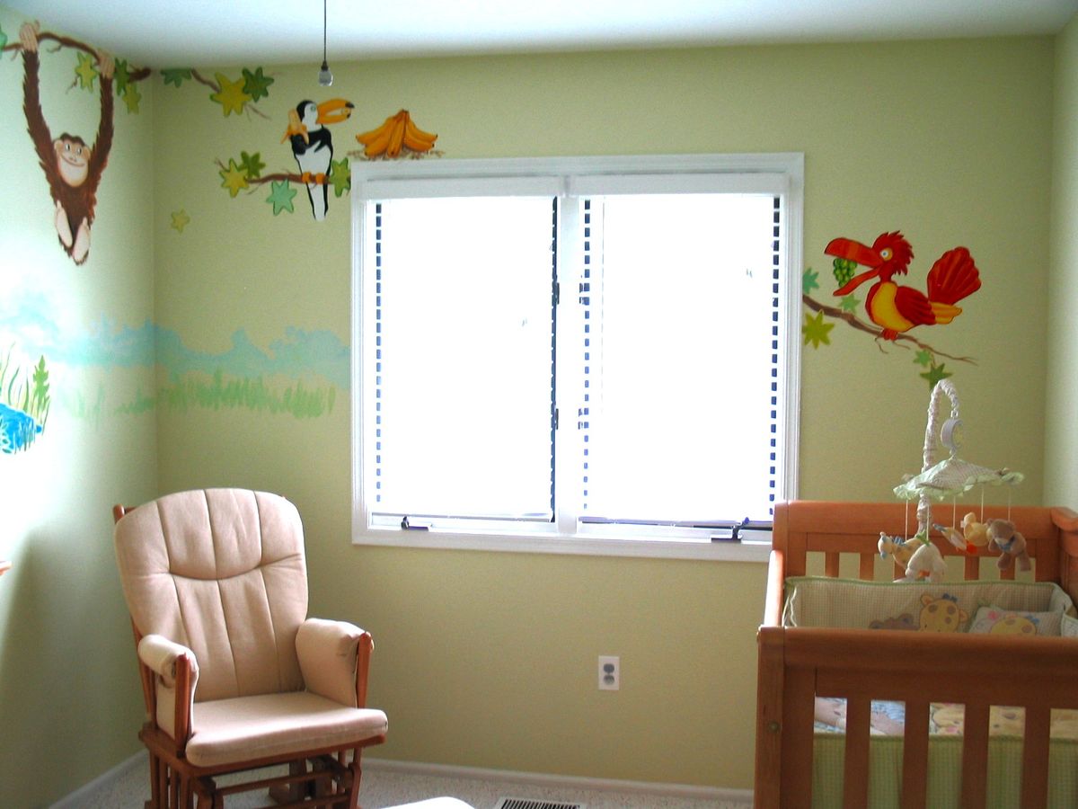
Around the fifth month, colour vision comes close to what we know from our own experience. The baby can distinguish subtle differences in shade, and their chromatic sensitivity starts matching the statistical regularities of natural scenes. Put simply, their eyesight tunes itself to the world they live in.
At six months, colour constancy appears: the ability to perceive an object's colour as the same regardless of the lighting. A red balloon stays red for the baby both in daylight and in the warm glow of a lamp.
Why visual experience matters
Here it gets genuinely interesting. Studies on young macaques showed that monkeys raised in an environment with limited access to the full colour spectrum later had lasting trouble distinguishing colours. Visual experience in the first months of life turned out to be essential for vision to develop properly.
Results from animal studies can't be transferred directly to humans, but observations of premature babies point to a similar mechanism: children with more visual experience (because they were born earlier) develop chromatic sensitivity faster than children of the same gestational age. The practical takeaway? The environment an infant grows up in genuinely shapes how they will see the world as an adult.
What does this mean for a child's room?
A few conclusions I use in my own projects.
In the first weeks, go for high contrast. Black-and-white patterns, graphics with strong red, simple geometric forms: these engage a developing eye most strongly.
From the third month, it's worth introducing a richer palette: warm reds, yellows, vivid blues. A mural with large, simplified forms in clean colours will do more for a baby than an elaborate pastel pattern.
From around the sixth month, your little one starts appreciating subtlety. That's when gradients, gentle colour transitions and a more developed visual story on the wall come into their own. And if you're torn between a botanical motif and geometry, I compare both directions in a separate article.
One last thing: avoid uniform walls. An all-white room looks clean, but it gives a baby the bare minimum of visual stimulation. One wall with a painted design is enough, even a simple one, as long as it's contrasty and saturated.
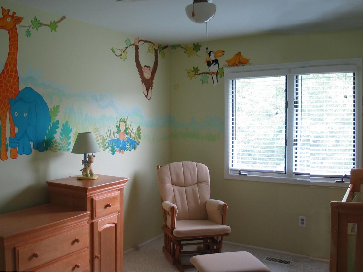
Art that grows with your child
When I design a mural for a child's room, I keep in mind that the child will look at it thousands of times, at different stages of their development. What today is merely a contrasting patch of colour will, in a few months, become an elephant or a tree, and years later it will return as a childhood memory. I like to think I paint for a viewer who is only just learning to see.
Knowing how infants really see lets me design spaces that genuinely support a small person's development. Good interior photos are a nice bonus. Colour is the first language a space speaks to a child, and it starts on the very first days of their life.
If you're planning a room for your little one, I'll gladly help you choose a mural design matched to your child's age and the character of the interior. I create murals in Kraków and Warsaw. You'll find rough rates in my mural price list, and we'll settle the rest during a consultation. → [Book a consultation]